Spectra Pronto
Brand identity and accessories
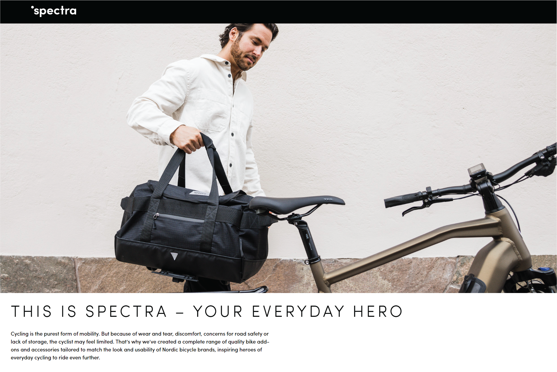
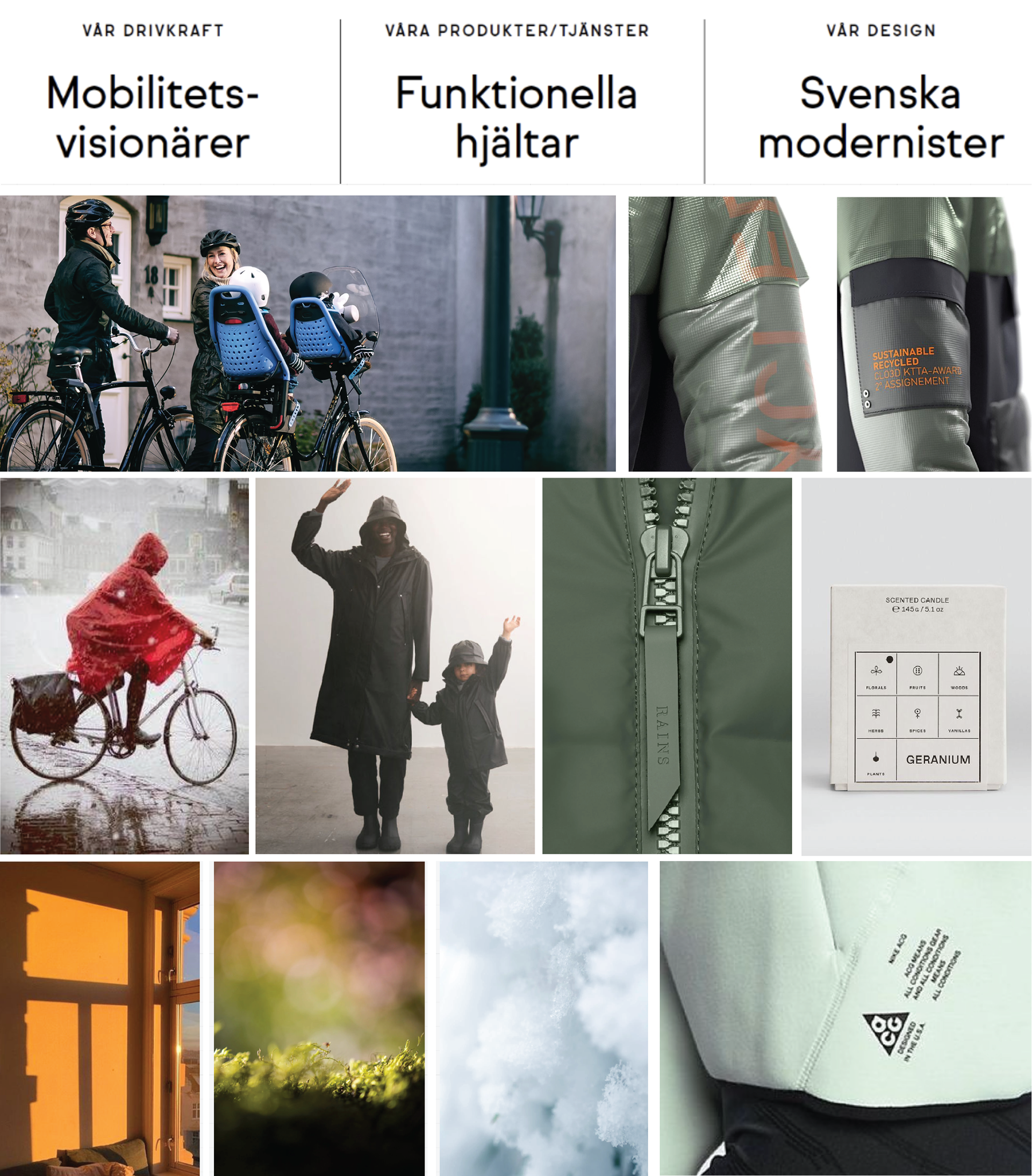
This is a comprehensive overview of the recent project undertaken to redesign the logo for Spectra, a leading provider of bike accessories. The goal of this initiative was to create a visually appealing and strategically aligned brand identity that resonates with our target audience: Mobility visionaries, everyday heroes, and Swedish modernists. Understanding their values, preferences, and lifestyles formed the foundation of our redesign strategy.
The primary objective was to create a logo that not only captured the essence of our brand but also appealed directly to our target audience. We aimed to evoke emotions of innovation, reliability, and modern aesthetics.


Colors on Spectra Logo
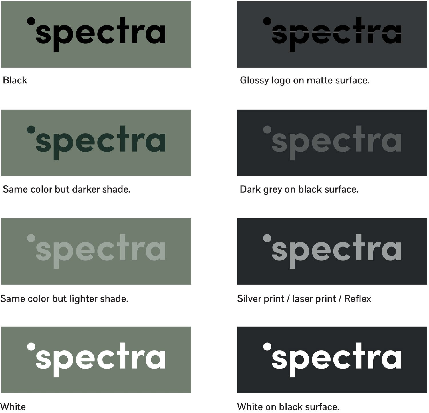
The spectra logotype may be placed in a lighter or darker shade of the background color, but it must always have enough contrast to remaining visible.
On products, the logotype can be in the same color as the surface, but with a contrasting finish. For example, matte on a glossy surface or glossy on a matte surface.
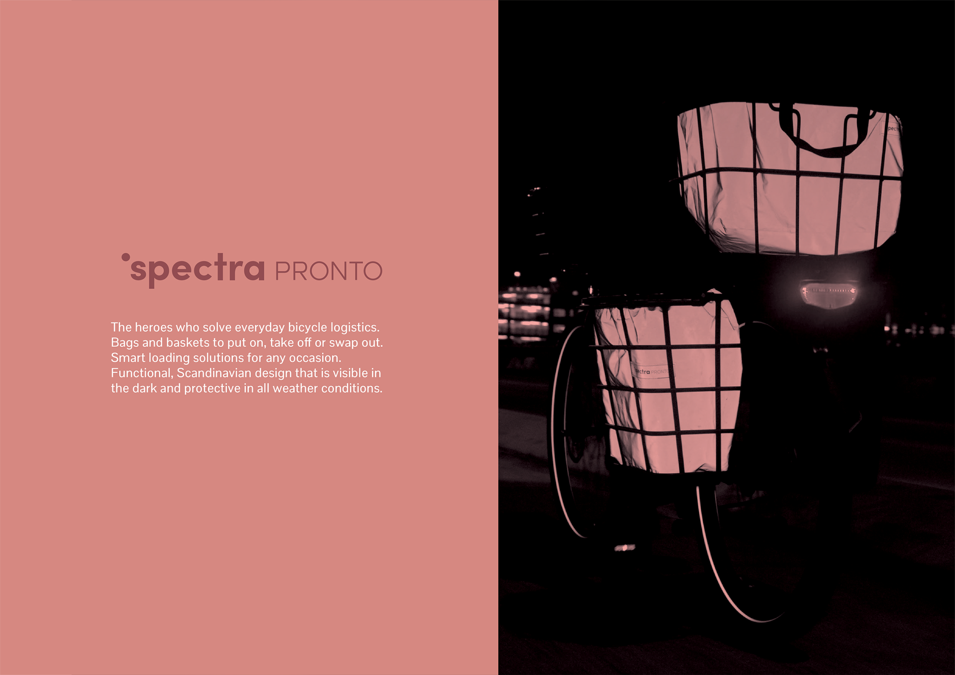
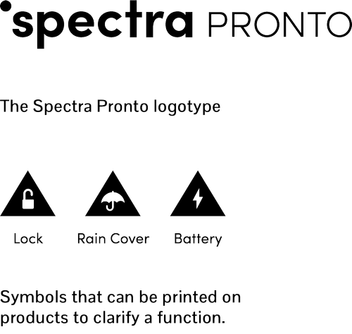
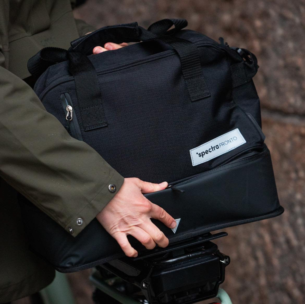
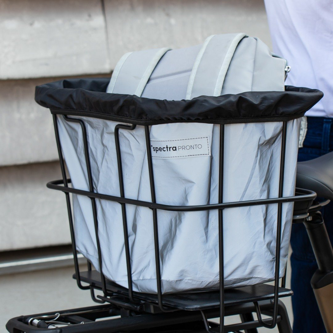
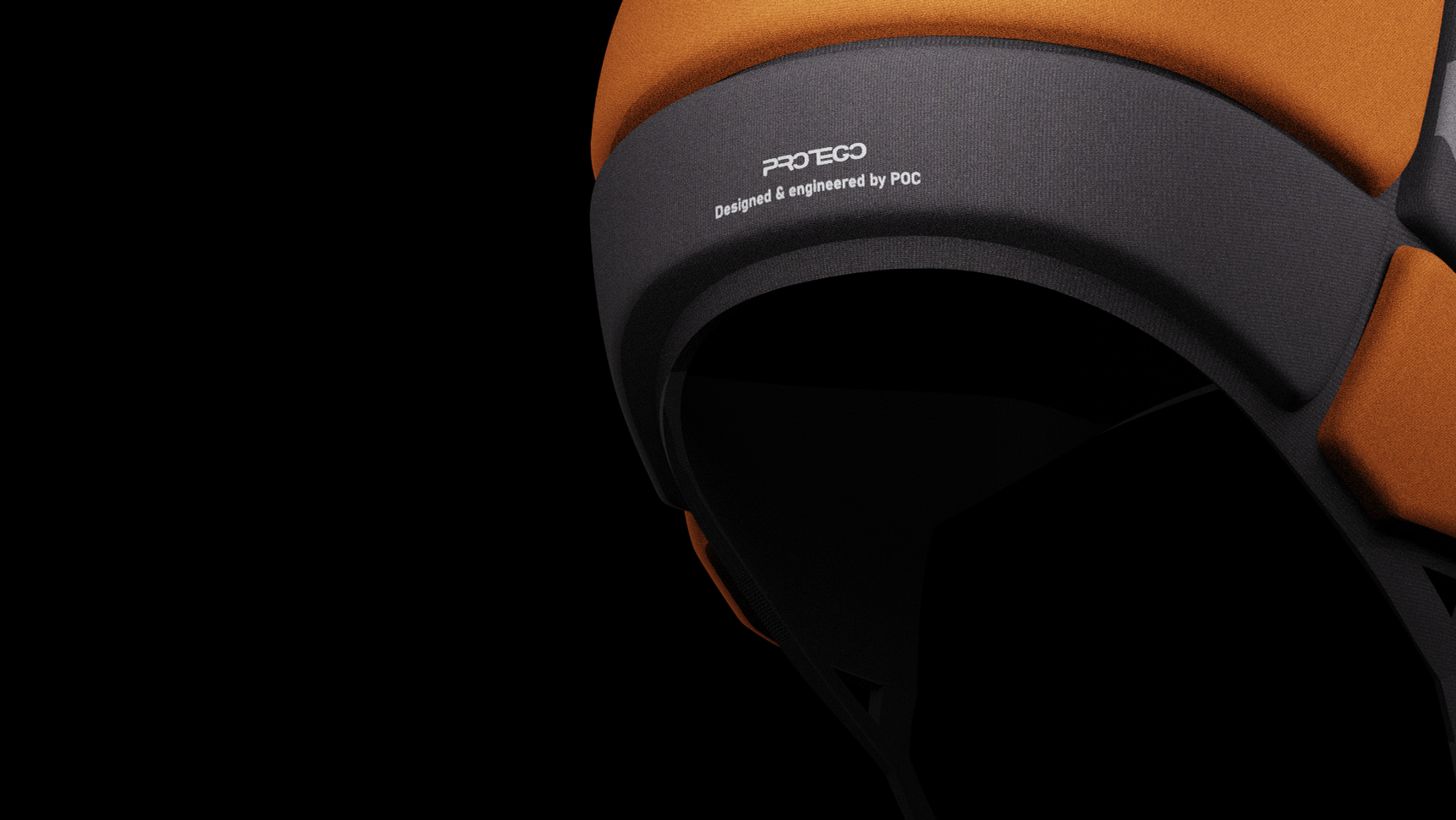
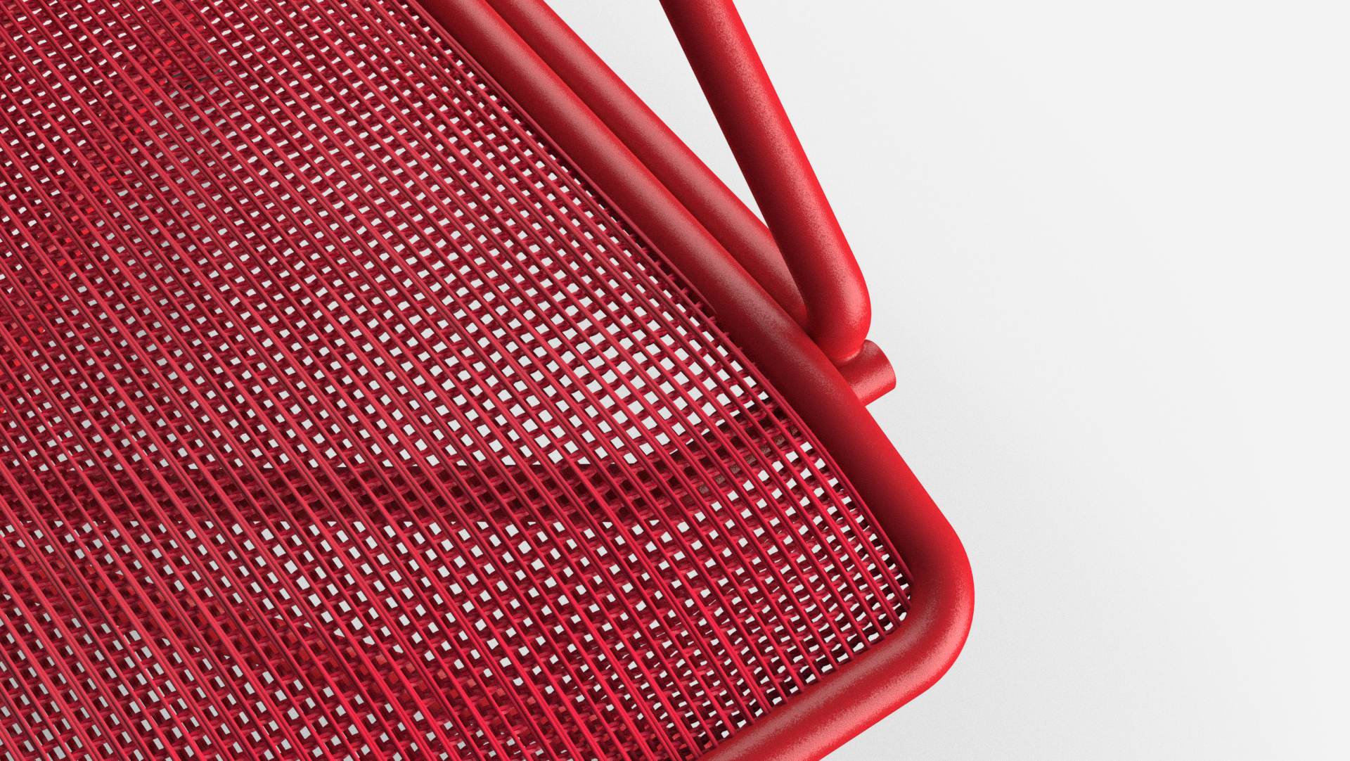
Product Graphics
To enhance the recognition of the PRONTO range, similar materials, colors, and graphics are used across all products. Symbols that explain features are printed on the product surface, close to the relevant part or function.

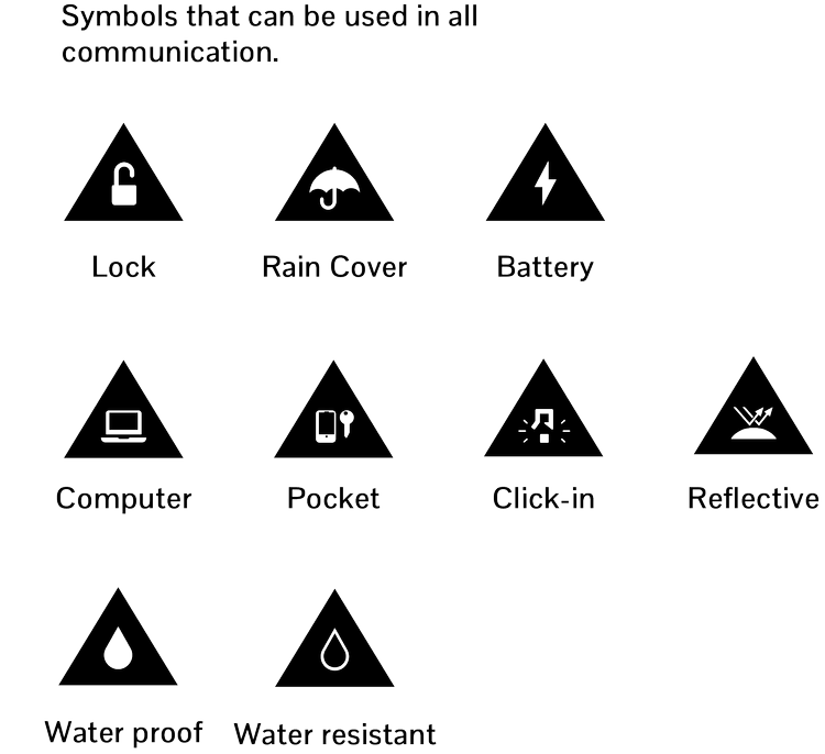
Communication
The Spectra PRONTO bags and baskets are categorized into three types: side-mounted, click-on baskets, and click-on bags. To help dealers and customers navigate our product range more easily, we use specific colors for each category. These colors should be used consistently across all printed materials, packaging, and communications.